At the cutting table
- What the background is doing
- Value and scale checks
- A three-swatch audition
- When a busy background works
Background fabric has a structural job
In a pieced block, the background often outlines the feature shape, links repeated blocks, and sets the amount of visual breathing room. That is why a fabric that looks quiet on the bolt can become very present once it appears in every corner and snowball unit. Background is a role, not a color category.
Start by asking what you want the background to do. Should it recede so the star or flower is clear? Should it blend with the feature fabrics for a low-volume surface? Should it carry a small print that adds texture without becoming another block shape? Your answer gives you a better test than “is this neutral enough?”
Check value before matching color
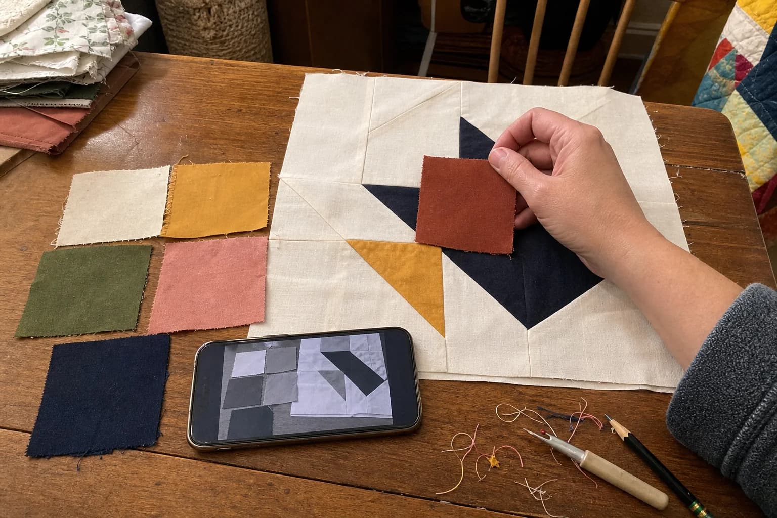
Put the background beside the fabrics it will touch most. Then squint or look at a grayscale photo. If the background and the feature fabric become the same lightness, the block may lose its edge. That can be lovely in a soft quilt, but it is worth seeing on purpose. If you want a strong block, choose a background that reads meaningfully lighter or darker than the feature fabric where the pattern relies on contrast.
Do not judge this from a screen alone. Screens, room light, texture, and dye lots all change color. Real swatches give a more honest answer. If you are ordering online, treat the screen as a way to narrow choices, then verify with fabric in hand before committing the whole top.
Print scale matters as much as busyness
A print can work as background when its scale supports the unit size. A tiny all-over dot or low-volume text print may read as one steady field in a 3-inch square. A large contrasty flower can be sliced into so many different fragments that it competes with the block. Neither print is bad. The issue is whether it gives the eye a place to rest.
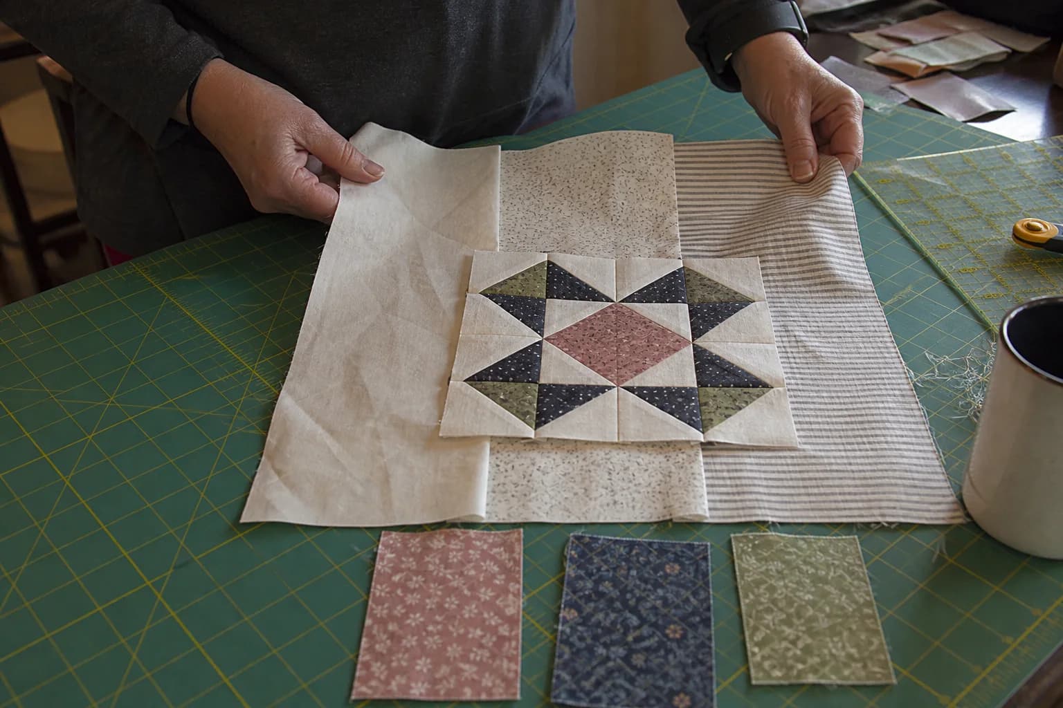
Cut or fold a small square from the background candidate and place it beside a small feature unit. If the print creates a new accidental shape, try a calmer scale. If it simply adds a little texture, it may be doing exactly what you hoped.
Worktable test: audition three backgrounds with the same feature pair
Choose two feature fabrics from the pull. Then set out three possible backgrounds: one lighter, one near the same value, and one darker. Make a small paper or fabric arrangement that repeats the key seam of the block. Photograph it in color and grayscale.
- Lighter background: often makes medium and dark features step forward.
- Similar-value background: can create a blended, gentle result and soften block lines.
- Darker background: may make light features pop, while changing the weight of the whole quilt.
For example, a pale floral star can look airy on warm ivory, misty on pale gray-blue, and dramatic on charcoal. There is no universal winner. The useful result is knowing which mood you are buying enough fabric to repeat across the quilt.
Let the pattern have a vote
Some designs use background in more than one role. Sashing, cornerstones, borders, and negative space may be listed separately. Read the pattern's fabric key before combining them because a change in one role can change the finished layout. If the pattern leaves a placement or measurement unclear, stop and ask the designer rather than reverse-engineering a cutting plan from the cover image.
Once the background choice feels settled, run your pull through the value-versus-color check and make a small test block if the quilt matters enough to protect the good fabric. That little pause is usually easier than trying to fix a background after it has been stitched through every block.