
Fabric planning
How to use grayscale for quilt fabrics before you cut
A grayscale photo is a quick way to turn down the color volume and ask a simpler question: do the light and dark parts of this block still read? It is a check, not a verdict.
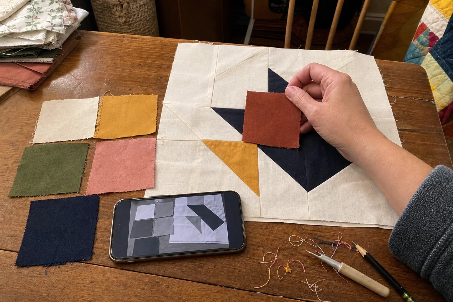
At the cutting table
What to notice first
- What grayscale reveals
- How to photograph a fabric pull
- How to test at block scale
- What the check cannot promise
Grayscale is a value check, not a style filter
When you view fabrics in grayscale, most of the hue disappears and the light-to-dark relationship becomes easier to notice. That is useful in quilting because a block often needs a background, feature, and accent to read as different shapes. Two fabrics can be far apart on the color wheel and still land at nearly the same gray.
The goal is not to make your quilt look good in black and white. It is to see whether the construction idea stays visible when color is no longer doing all the work. A star that becomes one even gray field may be perfect for a soft quilt, or it may be telling you the points need a different value.
Set up a useful photo
Use real fabric pieces, not tiny retailer thumbnails. Lay the candidates together in the roles you are considering, with no strong patterned surface beneath them. Take a straightforward photo in ordinary light. You do not need studio lighting or a polished flat lay. You need a photo that lets you compare the same group after it becomes grayscale.
Keep the camera roughly above the fabrics and include enough of each piece to see its overall read. If a large floral is part of the pull, take another photo with a small cut from the floral. The value of the whole repeat can differ from the value that lands inside a 2-inch unit.
Worktable check: photograph the block, not just the pile
- Write the block roles on scraps of paper: background, points, center, or whatever the pattern names.
- Place each candidate fabric in its role. If you have a coloring page or block diagram, put the scraps in the same arrangement.
- Take one color photo, then switch to grayscale.
- Ask whether the planned shape is still easy to find. Look for two adjacent roles that melt together.
- Change one fabric at a time and photograph again. Keep the version that matches the effect you want.
Suppose a background is pale sage, the points are dusty rose, and the center is navy. In color, the combination may feel balanced. In grayscale, the sage and rose might both read light while the navy reads dark. That can make a two-value block, with the center doing all the contrast work. If the pattern needs three distinct areas, you might try a deeper rose or a lighter background. If a quieter two-value look is what you wanted, you have useful confirmation.
Read the result with some humility
Grayscale is not a scorecard. It cannot tell you whether you will love the palette, whether a dye lot will match another bolt, or whether the finished quilt will look the same in every room. Fabric texture, sheen, print scale, batting, quilting density, and the distance from which the quilt is seen all add their own say.
It also should not overrule an intentional low-contrast choice. If you are making a low-volume quilt, a blended background, or a subtle secondary pattern, a muted grayscale result may be exactly the point. The check is successful when it makes the tradeoff visible before cutting.
Use the photo to make one next decision
If the grayscale view reveals a problem, do not assume the whole pull failed. Try changing the background first, because it touches so many seams and units. Then consider print scale: a medium-value solid may be a steadier partner than a busy medium-value print in a tiny block. The guide to fabric value for quilt blocks has another quick visibility check.
For an important quilt, make a few units from scraps, press them, and take the same grayscale photo. A test block tells you more than a stack of fat quarters. It also lets you stop early if the pattern's fabric roles are unclear. A pretty picture is not enough to safely infer cutting or placement information.
The questions that come up next
Common questions
Do I need a special app?
No. A phone camera and any basic grayscale or black-and-white view is enough for this planning check.
What if the photo looks different from the fabric?
Use the photo to compare relative lightness and darkness, then return to the real swatches. Lighting and a camera can alter the image.
Should I use grayscale for every quilt?
It is especially useful when a block needs distinct shapes, a background feels uncertain, or fabrics are close in value. A deliberately blended quilt may not need strong separation.
Quilt math, without the second-guessing
One short email when a new guide or calculator lands. No sales sequence.
You're agreeing to quilt-math emails from Stitchtale. Unsubscribe any time; this is separate from signing in.