
Fabric planning
How to choose fabric value for a quilt block
You can love every fabric in a pull and still lose the block you meant to make. The missing piece is often value: how light or dark each fabric reads beside the others.
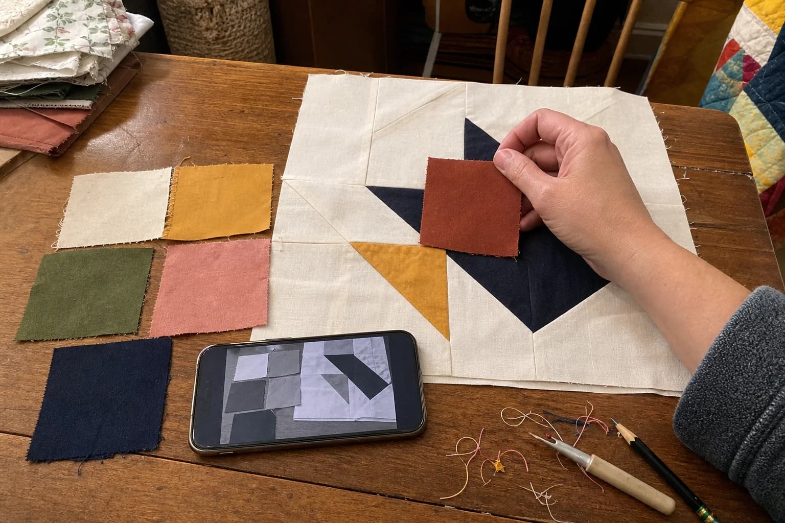
At the cutting table
What to notice first
- What quilters mean by value
- Two quick visibility checks
- How background, feature, and binding can differ
- When low contrast is a deliberate choice
Value is lightness and darkness
Value means how light or dark a fabric reads next to another fabric. It is not the fabric's color name. A red and a green can read at nearly the same value, while two blues can read very differently. When values are separated, blocks, seams, and shapes are easier to see from across the room.
This is why a block can seem to disappear even when every fabric is beautiful on its own. The fabrics may be close in value where the pattern needs the shape to stand apart.
Try a squint check and a grayscale photo
Put the fabrics together in the roles you are considering. First, squint at them from a little distance. Then take a photo and view it in grayscale. These checks reduce color to a simpler light-and-dark question: can you still see the block?
They are useful ways to notice a likely problem before cutting, not rules that choose a palette for you. Lighting, fabric texture, and the scale of a print can all change how a fabric reads in a finished quilt.
Give each fabric a job
Many blocks become easier to read when you name the job each fabric is doing. A background can sit behind the shape. A feature fabric can carry the star, flower, or other part you want to notice. Binding can frame the edge, or it can make the edge feel heavy when it reads much darker than the quilt.
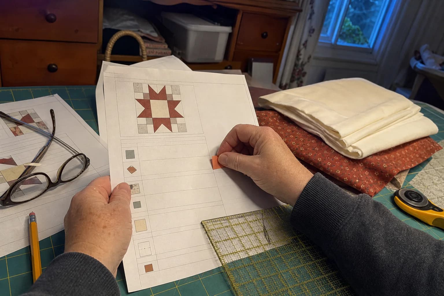
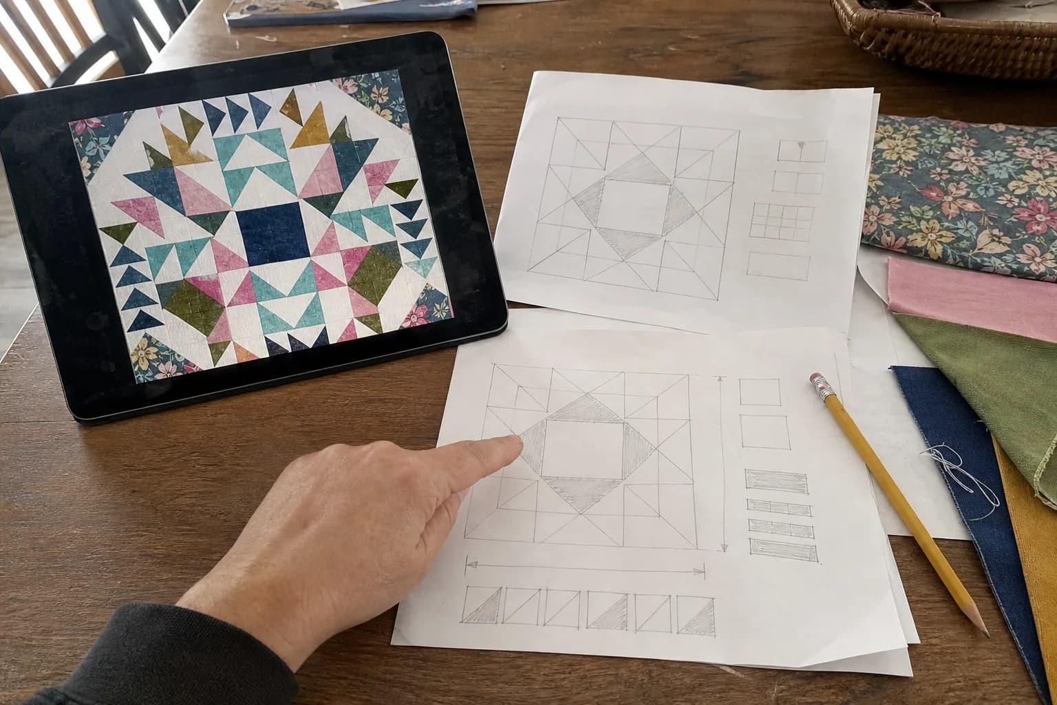
There is no required formula for those roles. Ask whether the background is distinct enough from the feature fabric, and whether the binding supports the balance you want. An editable layout can be a helpful place to compare placement ideas, but it does not replace a real fabric check.
Low contrast can be the point
Similar values are not a mistake by themselves. They can create a gentle, blended effect. The tradeoff is that the planned block or shape may not announce itself at a distance. That can be exactly right for a quilt meant to feel quiet, but it is worth choosing intentionally.
If the pattern depends on a star, chain, or other strong shape, test whether the effect still reads at the distance where you expect the quilt to be seen. If it does not, you can change one fabric before you have cut into the whole pull.
Make a small swatch test before cutting
For an important match, bring together real swatches or small pieces of the fabrics and repeat the checks in the light where you will use them. A screen cannot promise an exact fabric color: monitor settings, lighting, dye lots, and fabric texture all matter. A small test gives you something more useful than a screen preview before you cut the full quilt.
Once the values feel right, use the before-cutting checklist to confirm where each fabric belongs in the pattern.
The questions that come up next
Common questions
Is fabric value the same as color?
No. Color names describe hue, while value describes how light or dark a fabric reads next to another one. Two different colors can have similar value, and two fabrics in the same color family can have very different value.
How can I check whether my block has enough contrast?
Lay the fabrics together and squint, then look at a grayscale photo of the grouping. If the block's planned shapes are still easy to pick out, the value separation is doing some of the work. This is a check, not a guarantee of a finished quilt's look.
Can I make a low-contrast quilt on purpose?
Yes. Similar values can make a soft, quiet quilt. The tradeoff is that a planned block, seam, or shape may be less visible from across the room. Decide whether that softer effect is what you want before cutting.
Keep the project moving
Read next
Quilt math, without the second-guessing
One short email when a new guide or calculator lands. No sales sequence.
You're agreeing to quilt-math emails from Stitchtale. Unsubscribe any time; this is separate from signing in.