
Fabric planning
Fabric value vs. color in quilting: why a pretty pull can lose the block
Color makes you reach for a fabric. Value, the lightness or darkness it reads beside its neighbors, helps the block hold together. They overlap sometimes, but they are not the same job.
At the cutting table
What to notice first
- What value means at the cutting table
- Why color names can mislead
- A low-stakes pull test
- When similar values are intentional
Color gets the attention. Value gives the block a spine.
Quilters use color for the hue we see: tomato red, moss green, navy, butter yellow. Value is the fabric's light-to-dark position when it sits next to another fabric. A pale pink and a pale aqua may read almost alike in value. A charcoal floral and a deep plum solid can do the same, even though the colors feel completely different.
That distinction matters because many pieced blocks rely on light and dark roles to show a star, chain, flower, or secondary pattern. When two intended roles land at the same value, seams can still be beautifully sewn, yet the planned shape may blur. Nothing is wrong with the fabric. The pull simply is not doing the structural job the block asks of it.
This is also why naming a fabric only by color can lead you astray. “I need a blue background” says very little about whether the background will sit back from a medium blue feature print. At the cutting table, “light background, medium feature, dark accent” is often the more useful note.
Print scale can change the read
A fabric does not have one fixed value in every use. A small, even print may read as one value from across the room. A large-scale print can contain light and dark areas that shift from piece to piece. A dark fabric with white flowers may look medium when it is cut into small units. Texture and sheen can add another little surprise.
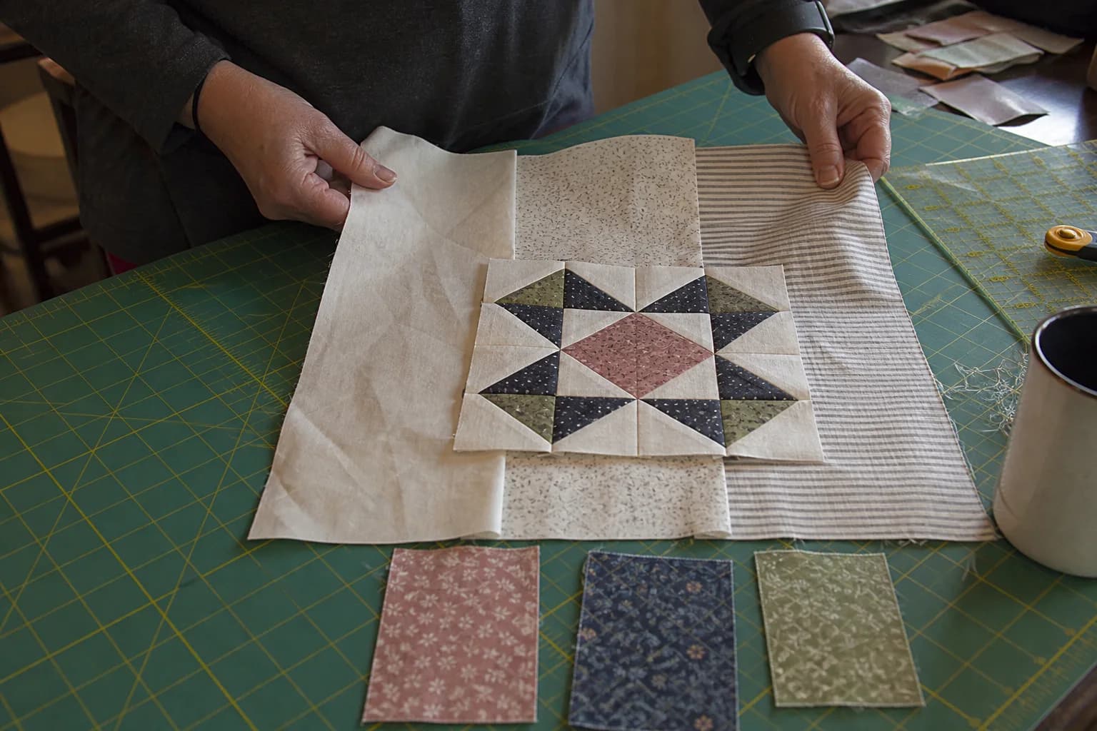
That is not a reason to avoid prints. It is a reason to audition them at the scale of the unit you are actually making. Put a 2½-inch square of the print beside the background instead of judging from a whole folded yard. If the pattern has tiny pieces, make the comparison tiny too.
Worktable test: give each fabric a role before the rotary cutter comes out
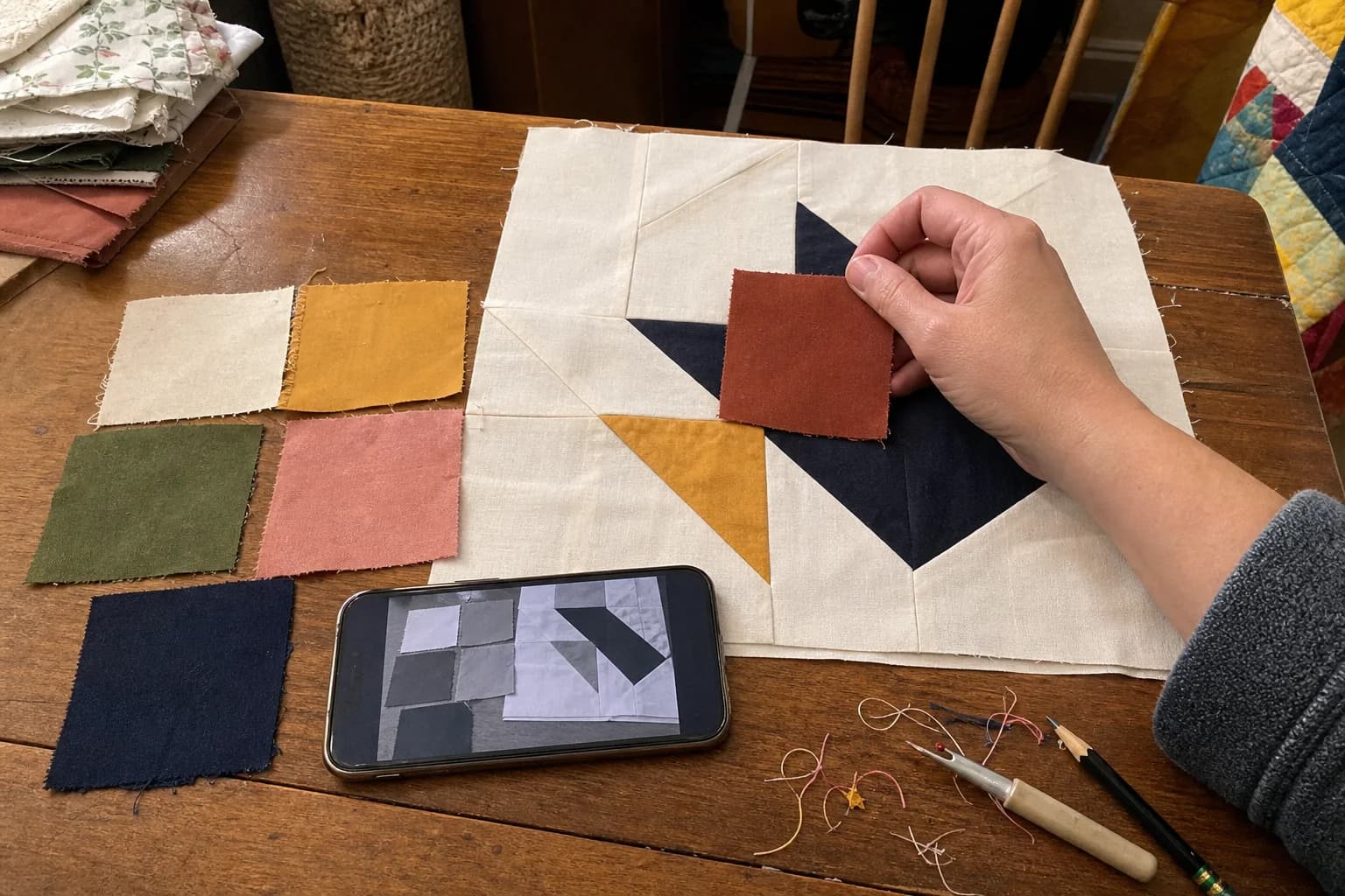
Pull a few small pieces from each candidate fabric. Label a scrap of paper with the roles your block needs, such as background, star points, center, and accent. Place the fabrics in those spots, then do this short check:
- Step back or squint until the color chatter settles down. Can you still pick out the intended shape?
- Take one ordinary phone photo and view a grayscale copy. You are looking for separation, not a flattering photograph.
- Move the fabrics around once. If two roles disappear into each other, try changing only one fabric before replacing the whole pull.
- Cut a few test units from scraps if the block depends on a large print or a very small piece. Press them as the pattern directs and look again.
For example, imagine a sawtooth star that needs a background, dark points, and a medium center. A teal background and a berry point fabric can look lively together in color, but if both become middle gray in the photo, the star points may not separate. Swapping the background for a lighter teal or choosing a darker berry changes the value relationship without requiring a new color story.
Low contrast is a choice, not a failure
Not every quilt is meant to announce its block from the doorway. Close values can make a soft, misty, antique, or low-volume effect. In that case, the same test still helps: it tells you what you are choosing. If the star fades and you like the quieter surface, keep going. If you wanted a crisp star, the test caught the mismatch before your favorite fabric became dozens of cut pieces.
Binding can join this conversation too. A very dark binding can frame a light quilt sharply, while a similar-value binding can let the quilt edge recede. Neither choice is automatically better. Hold a strip at the edge of your pull and ask what job you want the edge to do.
Keep screen color in its place
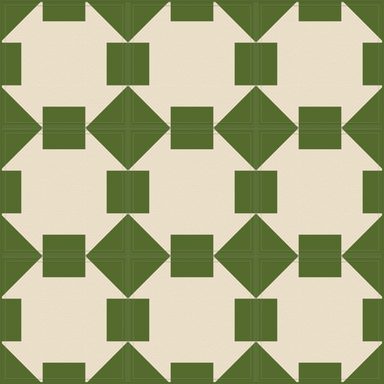
A layout on a screen can help you compare placement, but it cannot promise an exact fabric match. Screens, room light, fabric texture, and dye lots change what you see. Use a screen to explore an idea, then use real swatches to make the decision. If you are working from a pattern, confirm the fabric key and placement plan with the before-cutting checklist.
Value is not a rulebook for your stash. It is a plain way to see why a pull works, or why it needs one small adjustment. Once you can name light, medium, and dark roles, you have a calmer next step than hoping the block will sort itself out after assembly.
The questions that come up next
Common questions
Can different colors have the same value?
Yes. A blue and a rust can both read medium-dark when color is removed. That is why a fabric pull needs a value check rather than a guess based on color family.
Does every quilt need high contrast?
No. A quiet, blended quilt may use close values on purpose. The useful question is whether the softer effect matches the block and look you want.
Can I trust a phone photo for fabric value?
A grayscale photo is a helpful comparison, not a color guarantee. Check real swatches too, because light, texture, dye lots, and screens all affect how fabric reads.
Quilt math, without the second-guessing
One short email when a new guide or calculator lands. No sales sequence.
You're agreeing to quilt-math emails from Stitchtale. Unsubscribe any time; this is separate from signing in.