
Fabric planning
How to mix quilt fabric prints without losing the pattern
A mixed-print quilt does not need every fabric to behave. It needs enough order that the block still has a chance to show up. Start with scale and value, then let the prints bring the personality.
From the Stitchtale shelf
Try it on a quilt
At the cutting table
What to notice first
- Why print scale matters
- How to give prints different jobs
- A repeatable audition
- When one print should sit out
Mixing prints is about hierarchy, not matching rules
A quilt pull can hold florals, stripes, dots, plaids, novelty prints, and solids without looking like a fabric-store clearance bin. The helpful question is not whether every print coordinates perfectly. It is whether the fabrics are trying to do the same visual job in the same small space.
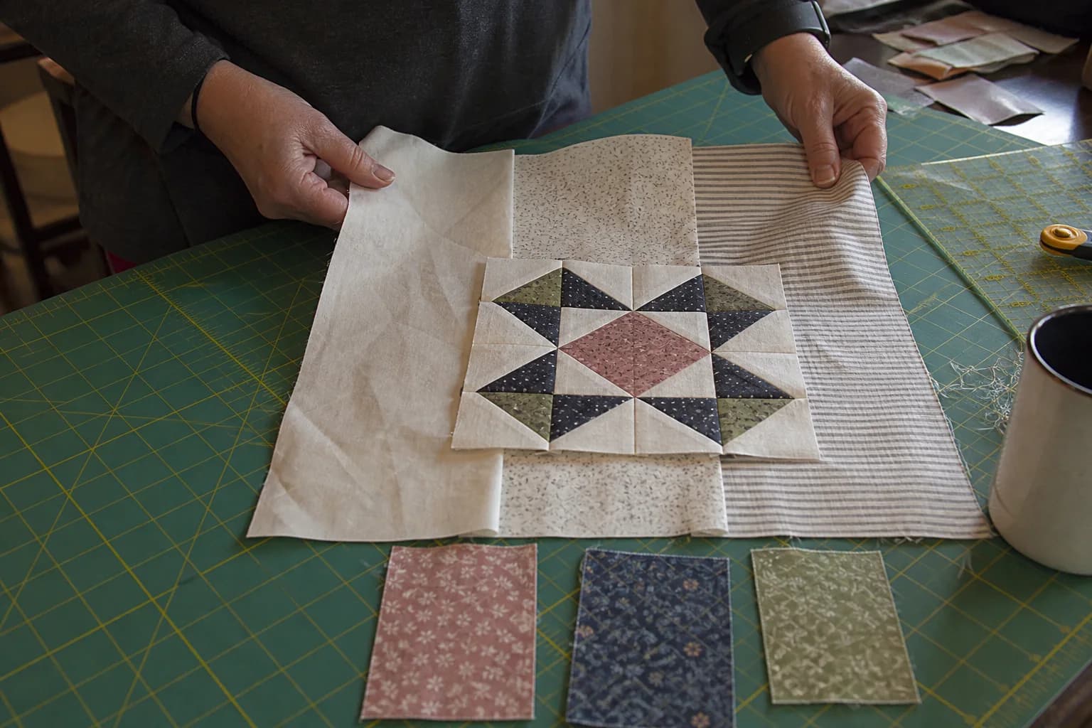
Think of a block as having roles. One fabric may carry the headline, another may make a quiet background, and a third may add a dark anchor. When each print has a different role, the eye has somewhere to land. When three loud medium-value large florals meet inside 1½-inch pieces, the pattern has to fight for its life.
Look at scale at the size you will cut
Fabric scale means the size of the motif or repeat. A large cabbage rose can be a star in a border or a big center square, yet turn into unrecognizable petals in tiny flying geese. A pin dot may look boring folded on the shelf but become a steady background once it appears dozens of times.
Before you buy extra yardage, fold a candidate print until roughly the same amount would show in the unit. Put it next to the other fabrics. This one small move catches a common surprise: the fabric you loved as a yard may not survive the cut size the pattern calls for.
Value still does the structural work
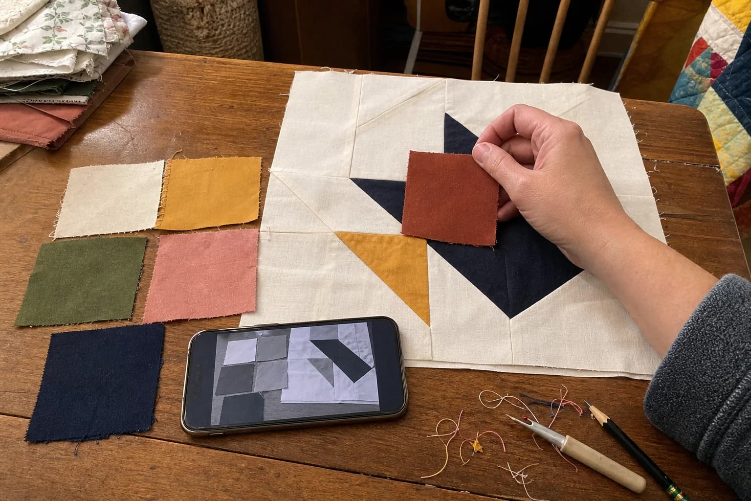
Two prints can look very different in color and still read as the same medium value. That can be fine when they belong in the same role, but it can flatten a block that relies on contrast. Use a squint check or a grayscale photo of the planned arrangement. You are not judging whether the prints are pretty in grayscale. You are checking whether the block's light and dark shapes remain visible.
If every print reads medium, add one clearer light or dark fabric. A solid is one option, not a rescue requirement. A low-volume print, a pale stripe, or a deep tiny-scale print can fill that role too.
Worktable test: make a five-piece fabric cast
- Choose one feature print you want to see clearly.
- Add one quieter print that can act as background or breathing room.
- Add one fabric that reads lighter and one that reads darker than the feature.
- Add a small-scale bridge print, if the pull needs one.
- Arrange the pieces as the block roles, then photograph the group in grayscale.
For a scrappy flower block, you might use a medium-scale red floral for petals, a darker tiny navy print for centers, a pale dot for background, and two green prints that differ in value for leaves. The fabrics do not need to come from one collection. They need enough separation for petals, center, and background to remain different things.
Use repeats thoughtfully
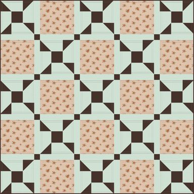
Repeated blocks magnify every choice. A high-contrast novelty print that feels charming in one unit can become a steady distraction when it appears sixty times. Conversely, a low-volume background becomes more visible as the quilt grows. Lay out several paper or fabric placeholders if you can, not just one block, and step back.
Keep a note about where a directional or large-scale print is meant to land. If a stripe needs to run one way, or a fussy-cut motif needs to sit in a center square, it belongs in the cutting plan. Read how to label cut quilt pieces before a scrappy project turns into a pile of anonymous parts.
Give yourself permission to move a fabric
A fabric does not have to be rejected because it overwhelms one unit. It may become a border, backing, binding, larger patch, or a single feature block. That is often a more satisfying answer than forcing it into a role it cannot hold. If you are using a pattern, follow its fabric requirements and do not infer substitutions from a cover image alone. The yardage check helps keep the purchase plan visible while you make those changes.
The questions that come up next
Common questions
Can I use all prints in one quilt?
Yes. It helps when the prints do not all compete at the same scale and value. A small test arrangement can show whether the pattern still reads.
Do prints need to match by collection?
No. A shared collection can make choosing easier, but value, scale, and the fabric roles matter more than a matching selvedge.
What if a print is too pretty to leave out?
Try it in a larger unit, border, backing, or binding. A fabric can be right for the quilt without being right for every block role.
Quilt math, without the second-guessing
One short email when a new guide or calculator lands. No sales sequence.
You're agreeing to quilt-math emails from Stitchtale. Unsubscribe any time; this is separate from signing in.